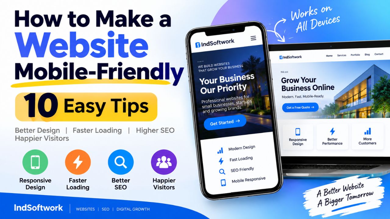
How to Make a Website Mobile-Friendly: 10 Easy Tips
Your website looks great on your laptop. The layout is clean, the images are sharp, and everything sits exactly where it should. Then you open it on your phone and the illusion collapses. Text runs off the screen. Menus overlap. A button you need to tap sits right next to another button, and you keep hitting the wrong one.
This is the reality for a huge number of websites — and it's costing their owners real traffic. Most people browsing the web today are on a smartphone. In India, mobile devices account for the majority of all internet usage. When your site doesn't work on a phone, visitors don't stick around to figure it out. They leave, and they go to a competitor whose site does work.
Making a website mobile-friendly doesn't require a complete redesign or a developer on retainer. It comes down to ten practical fixes, most of which you can apply yourself. This guide walks through each one with clear explanations and real examples, so you can start improving your site today.
- What "Mobile-Friendly" Actually Means
- Tip 1: Add the Viewport Meta Tag
- Tip 2: Choose a Responsive Layout
- Tip 3: Increase Your Font Size
- Tip 4: Enlarge Your Tap Targets
- Tip 5: Compress and Resize Images
- Tip 6: Simplify Your Navigation Menu
- Tip 7: Eliminate Horizontal Scrolling
- Tip 8: Improve Your Loading Speed
- Tip 9: Ditch the Intrusive Pop-Ups
- Tip 10: Test on Real Phones
- Quick Reference Checklist
- Which Fix Should You Start With?
- Frequently Asked Questions
- Conclusion
What "Mobile-Friendly" Actually Means
A mobile-friendly website is one that works comfortably on a small touchscreen. That means text is readable without zooming, buttons are big enough to tap accurately, the layout fits the screen width, and pages load quickly on a mobile connection.
It's not just about looking okay on a phone. It's about the entire experience: navigating, reading, filling forms, and completing whatever action the visitor came to do. A site can look fine in a screenshot and still be frustrating to actually use.
Google also has a specific definition. Its mobile-friendly test checks whether text is legible, tap targets are appropriately sized and spaced, content fits the viewport, and there are no intrusive interstitials blocking access. These factors feed into how Google evaluates and ranks pages, especially since mobile-first indexing became the default.
There's also a distinction between mobile-friendly and mobile-responsive. Responsive design is a technique — one site that adapts to any screen using fluid grids and media queries. Mobile-friendly is the outcome. A responsive site is usually mobile-friendly, but a site can be mobile-friendly without being fully responsive, especially if it uses a separate mobile version.
Tip 1: Add the Viewport Meta Tag
If your website doesn't have a viewport meta tag, this is the first thing to fix. Without it, mobile browsers treat your page as a desktop site and shrink everything down to fit. The result is text you can barely read and buttons you can't tap without zooming in.
The tag itself is one line of code, placed inside the section of every page:
Breaking it down: width=device-width tells the browser to match the page width to the device's screen width. initial-scale=1.0 sets the initial zoom level to 100%, so nothing starts zoomed out or zoomed in.
Most modern content management systems include this automatically. WordPress themes, Shopify themes, and website builders like Wix and Squarespace handle it for you. But it's worth verifying. Open your site in a browser, right-click, and select "View Page Source." Search for "viewport." If it's there, you're covered. If not, add it manually or through your theme's header settings.
Why This Matters So Much
Without the viewport tag, nothing else you do for mobile will work properly. Font sizes will appear tiny. Responsive CSS may not trigger correctly. Tap targets will be scaled down. It's the foundation, and it takes two minutes to fix.
Tip 2: Choose a Responsive Layout
Responsive design means building one website that adapts its layout based on the screen size. Instead of maintaining separate desktop and mobile versions, you have a single codebase that reflows content, resizes images, and rearranges elements to fit whatever device is viewing it.
This is the standard approach today, and Google recommends it. It avoids duplicate content issues, keeps your URLs consistent across devices, and is far easier to maintain than running two separate sites.
If you're using a CMS, choosing a responsive theme is the simplest path. Look for themes that explicitly state they're responsive. Then verify by loading the theme's demo on your phone. Don't take the marketing copy at face value — check it yourself.
Signs of a Good Responsive Theme
- Container widths are fluid, not fixed in pixels
- Images scale down automatically without breaking the layout
- Navigation collapses into a hamburger menu on small screens
- Form fields stack vertically on mobile
- Sidebars move below the main content rather than squeezing it
- Tables either scroll horizontally within a container or reformat as stacked blocks
If you're building a site from scratch, write your CSS mobile-first. Start with the small screen layout, then use media queries to enhance it for tablets and desktops. This approach forces you to prioritise content and keeps the mobile experience clean rather than trying to cram a desktop layout into a phone.
Tip 3: Increase Your Font Size
Text that reads comfortably on a 24-inch monitor often becomes unreadable on a 5-inch phone screen. If your body text is set at 12px or 14px, mobile users will need to zoom in to read it — and many won't bother. They'll just leave.
Set your base font size to at least 16px. This is the default size most mobile browsers use, and it's a reliable minimum for comfortable reading without zooming. Headings should scale up proportionally on mobile: an H1 around 28–32px, an H2 around 22–26px, and an H3 around 18–22px.
Line height is just as important as font size. A line height of 1.5 to 1.6 times the font size gives text enough breathing room on a narrow screen. Tightly packed lines create visual density that's exhausting to read on mobile.
Recommended Mobile Typography Scale
| Element | Minimum Size | Ideal Range |
|---|---|---|
| Body text | 16px | 16–18px |
| H1 | 28px | 28–32px |
| H2 | 22px | 22–26px |
| H3 | 18px | 18–22px |
| Button labels | 16px | 16–18px |
| Captions | 14px | 14–16px |
Also keep your paragraphs short on mobile. Two to four sentences per paragraph is plenty. Long blocks of text are harder to track on a small screen, and breaking them up with subheadings makes the content scannable.
Tip 4: Enlarge Your Tap Targets
A finger is not a mouse cursor. A link that's easy to click on a desktop can be nearly impossible to tap accurately on a phone. Google recommends a minimum tap target size of 48x48 CSS pixels, with enough spacing around each target to prevent accidental taps on neighbouring elements.
This applies to buttons, navigation links, form fields, social icons, and anything else a user might touch. If two links sit adjacent to each other with no gap, even a careful tap can land on the wrong one.
How to Fix Small Tap Targets
- Increase button padding. The clickable area is the padded box, not just the text inside it.
- Add margin between adjacent links in menus and lists.
- Avoid icon-only buttons that have no visible text and a tiny hit area.
- Make form fields at least 48px tall so they're easy to focus.
- Ensure dropdown menus open on tap rather than requiring hover.
Hover states deserve a special mention here. Anything that only appears on hover — a submenu, a tooltip, an action button — effectively doesn't exist on a touchscreen. If important content or functionality is hidden behind a hover interaction, mobile users will never find it. Replace hover-triggered elements with tap-friendly alternatives.
Tip 5: Compress and Resize Images
Images are usually the biggest reason mobile pages load slowly. A high-resolution photo that looks stunning on a desktop can be three or four megabytes in file size. On a typical mobile connection, that single image could take several seconds to download. Multiply that by ten images on a page, and your site becomes unusable.
The fix involves two steps: resize and compress. Resizing means scaling images down to roughly the dimensions they'll actually be displayed at. There's no reason to serve a 4000-pixel-wide image that's shown at 800 pixels. Compressing means reducing file size while maintaining acceptable visual quality.
Image Optimisation Steps
- Resize each image to the largest size it will realistically be displayed at
- Compress it using a tool like TinyPNG, Squoosh, or ImageOptim
- Serve modern formats like WebP where supported — typically 25–35% smaller than JPEG at similar quality
- Use the
srcsetattribute to provide different image sizes for different screen resolutions - Enable lazy loading so images below the fold load only when the user scrolls near them
Most image optimisation plugins and content delivery networks handle WebP conversion and compression automatically. If you're on WordPress, plugins like Smush or ShortPixel can process your entire media library in one go.
Tip 6: Simplify Your Navigation Menu
Desktop navigation menus often stretch across the top of the page with a dozen items, nested dropdowns, and sub-menus. On a phone, that same menu becomes a cramped, unreadable mess. Mobile navigation needs to be stripped down and rebuilt for touch.
The hamburger menu — three horizontal lines that open a slide-out panel — is the standard solution. It saves space, it's widely recognised, and it gives you room to display menu items at a comfortable tap size once opened. But the hamburger alone isn't enough. The menu inside it needs to be well-organised.
Mobile Navigation Best Practices
- Limit top-level items to five or six at most
- Group related pages under clear category labels
- Use short, descriptive labels rather than clever names
- Make the menu easy to close — a visible X button and the ability to tap outside
- Keep key actions like "Contact" or "Buy Now" visible without opening the menu
- Add search if your site has many pages or products
- Ensure the open menu doesn't trap the user with no way back
Sticky headers can help with navigation, but use them carefully. A header that takes up a third of the screen when it sticks will frustrate users. A slim bar with just a logo and menu icon is a better compromise.
Tip 7: Eliminate Horizontal Scrolling
If you can swipe left and right on your phone to see content that doesn't fit, your site has a horizontal overflow problem. It's one of the clearest signs of a mobile-unfriendly website, and it makes reading anything a frustrating chore.
Horizontal scrolling is almost always caused by elements that are wider than the viewport. The usual suspects include fixed-width containers, oversized images, tables with too many columns, and long unbroken strings like URLs.
Common Causes and Their Fixes
- Fixed-width containers: Replace pixel widths with percentages or
max-width - Images without constraints: Add
max-width: 100%; height: auto;to all images - Wide tables: Wrap them in a scrollable container or reformat as stacked cards on mobile
- Long words or URLs: Apply
word-wrap: break-wordto prevent overflow - Absolute positioning: Check elements positioned outside the normal flow — they often extend beyond the viewport
- Embedded videos: Use a responsive iframe wrapper that scales with the container
To find the offending element, open Chrome DevTools in device mode and look for the horizontal scrollbar. You can also add a temporary CSS rule like * { outline: 1px solid red; } to see which element extends beyond the edge.
Tip 8: Improve Your Loading Speed
Speed and mobile-friendliness are inseparable. A site that looks perfect but takes eight seconds to load is not mobile-friendly. Mobile users are often on slower connections, and their patience runs out quickly. Research consistently shows that a significant share of mobile visitors abandon pages that take more than three seconds to load.
Speed improvements come from several areas, and most of them are straightforward to implement.
Speed Fixes That Make a Real Difference
- Compress images. Usually the single biggest win. Already covered in Tip 5.
- Minify CSS, JavaScript, and HTML. Removes whitespace, comments, and unnecessary characters to reduce file size.
- Enable browser caching. Returning visitors load assets from their own device instead of downloading them again.
- Use a content delivery network. Serves static files from servers geographically closer to your users, reducing latency.
- Reduce redirects. Each redirect adds an extra round trip that delays loading.
- Defer non-critical JavaScript. Load what's needed for the first screen first, and delay the rest.
- Lazy load images and videos. Only load media when it's about to enter the viewport.
- Limit third-party scripts. Analytics, chat widgets, and ad trackers all add weight and slow things down.
Run your site through Google PageSpeed Insights to get a mobile score and a prioritised list of issues. Work through the recommendations in order of impact, starting with the largest opportunities.
Tip 9: Ditch the Intrusive Pop-Ups
You tap a link on your phone. The page starts loading. Before you can read a single word, a full-screen overlay appears asking you to subscribe, accept cookies, or download an app. On desktop it's mildly annoying. On mobile, it's infuriating — especially when the close button is tiny or hidden.
Google explicitly penalises intrusive interstitials that block access to content on mobile. Sites that use them can see their rankings drop. There are exceptions for legally required notices like cookie consent or age verification, but even those should be implemented so they don't block the main content.
Better Alternatives to Aggressive Pop-Ups
- An inline signup form placed naturally within the content
- A small slide-in banner at the bottom that can be dismissed with one tap
- A delayed pop-up that appears only after the user has scrolled significantly
- A simple link in the footer or navigation menu
- Exit-intent triggers that work on desktop only
If you must use a pop-up, make the close button large and obvious. Don't require users to hunt for it. And never block content on the first page load.
Tip 10: Test on Real Phones
Chrome DevTools device mode is an excellent tool, and you should use it. But it's not a substitute for testing on actual devices. Emulators can't replicate real touch behaviour, actual network conditions, or performance on mid-range hardware.
Borrow a few phones if you can. An older Android device, a newer iPhone, a small tablet. Open your site, navigate through the main pages, and try to complete the actions your visitors care about most — reading an article, filling a contact form, adding something to a cart, completing a checkout.
Pay attention to how it feels, not just how it looks. Does scrolling feel smooth? Do taps register the first time? Does the keyboard cover important form fields when you tap into them? Do images pop in after a delay, or load smoothly?
What to Test on Real Devices
- Loading time on mobile data, not just Wi-Fi
- Form usability — especially the keyboard covering fields
- Menu opening, closing, and scrolling behaviour
- Tap accuracy on buttons and links
- Image loading and visual quality
- Scrolling smoothness across long pages
- Both portrait and landscape orientations
- Performance on older or slower phones
Quick Reference Checklist
Here's the condensed version of all ten tips for quick reference.
| Check | What to Verify |
|---|---|
| Viewport meta tag | Present in the of every page |
| Responsive layout | No fixed-width containers; content reflows naturally |
| Font size | Body text at 16px or larger with 1.5+ line height |
| Tap targets | Buttons and links at least 48x48px with adequate spacing |
| Images | Compressed, correctly sized, WebP where possible, lazy loaded |
| Navigation | Simple, collapsible, key actions always accessible |
| Horizontal scrolling | No element extends beyond the viewport width |
| Page speed | Under three seconds on mobile data |
| Pop-ups | None that block content on first load |
| Real device testing | Verified on at least one actual phone |
Which Fix Should You Start With?
If you're short on time, tackle these in order of impact.
- Add the viewport meta tag. Takes two minutes and fixes the foundation.
- Eliminate horizontal scrolling. Nothing else matters if users can't read the page.
- Increase font size. A quick CSS change with immediate readability improvement.
- Compress images. Usually the largest speed gain available.
- Enlarge tap targets. Small change, significant usability improvement.
- Simplify navigation. Requires more thought but pays off in engagement.
- Remove intrusive pop-ups. Instant improvement in user experience and SEO.
- Address remaining speed issues. Ongoing work, but each fix helps.
- Adopt a fully responsive theme if your current one isn't responsive.
- Set up regular real-device testing to catch new problems early.
The highest-impact fixes are also the simplest. You don't need a redesign to make meaningful progress. You need a few targeted changes and a habit of testing regularly.
Frequently Asked Questions
How long does it take to make a website mobile-friendly?
If your site already uses a responsive theme, basic fixes like the viewport tag, font sizes, and image compression can be done in a few hours. A full responsive rebuild takes longer, often days or weeks depending on the size and complexity of the site.
Can I make my website mobile-friendly without coding?
Yes, if you use a CMS or website builder. WordPress, Shopify, Wix, and Squarespace offer responsive themes and mobile editing tools. Plugins can handle image optimisation, caching, and other technical improvements without touching code.
What is the single most important mobile-friendly fix?
The viewport meta tag. Without it, mobile browsers render your site at desktop width and zoom out, making everything unreadably small. Adding it is a one-line change that fixes the foundation of mobile usability.
Does mobile-friendliness affect SEO?
Yes. Google uses mobile-first indexing, meaning it primarily uses the mobile version of your site for ranking. Mobile usability, page speed, and the absence of intrusive interstitials are all considered in Google's ranking systems.
How do I know if my website is mobile-friendly?
Open it on your phone and try to use it normally. If you need to zoom, scroll sideways, or squint, it's not mobile-friendly. For a technical assessment, run it through Google PageSpeed Insights or Chrome DevTools device mode.
What is the ideal mobile page load time?
Aim for under three seconds on a typical mobile connection. Faster is always better. Google's Core Web Vitals metrics, particularly Largest Contentful Paint, give a more detailed picture of how quickly your page becomes usable.
Should I create a separate mobile version of my website?
For most sites, no. Responsive design is preferred by Google, easier to maintain, and avoids duplicate content issues. Separate mobile sites are occasionally used for legacy reasons but are rarely the right choice for new projects.
Why do pop-ups hurt mobile friendliness?
Pop-ups that cover the main content make it harder for users to access what they came for. Google penalises intrusive interstitials in mobile search rankings. If you use pop-ups, keep them small, easy to dismiss, and never blocking content on first load.
How often should I test my website on mobile?
Test after any significant change, and at least once a quarter. Mobile devices and browsers update frequently, and new content can introduce new problems. Regular testing catches issues before they affect visitors.
Do I need to redesign my entire website to make it mobile-friendly?
Not necessarily. Many improvements — viewport tag, font sizes, image compression, tap target sizing, removing pop-ups — can be applied to your existing site. A full redesign is only needed if your theme or layout fundamentally can't adapt to small screens.
Conclusion
Making a website mobile-friendly isn't about perfection. It's about removing friction. Every tip in this guide addresses a specific point where a mobile visitor might get frustrated and leave. Fix enough of them, and your site becomes a place people actually want to use on their phones.
Start with the viewport meta tag. Fix horizontal scrolling. Increase your font size. Compress your images. Enlarge your tap targets. Each of these takes minutes and delivers immediate improvement. Then work through the rest at your own pace.
The most important habit to build is regular testing. Open your site on a real phone every time you make a change. Watch how it feels, not just how it looks. Your mobile visitors are already judging your site in seconds — make those seconds count.